Street Address
Brooklyn, NY
Phone Number
Portfolio for Sean Hackett
Your Custom Text Here

Digital Product Design
Design is problem solving. Design is what makes me happy.
Your Custom Text Here
Design is problem solving. Design is what makes me happy.
From hackathon to product launch
User research leads to higher adaptation
Used by a handful of lender partners, the portal’s intention was to be the go-to way to share potential borrower information for underwriting.
Our goal was to standardize, as much as possible, the processes and increase compliance to encourage adaptation by more partners.
The portal hadn't been touched by product or design in a long time. Because of this didn't know if it was successful or not. There was a lot of lending partners that did not use it and we didn't know the reasons. Was it bad design, not meeting needs, or something else?
Because partners didn't use the portal, our communication flow was a mess. Communications were happening outside of our system and there for we could not accurately track messages or incorporate data into our backend system.
Making the complex simple
When I first started my last position I had several onboarding sessions that, while informative, did not paint one cohesive picture of our internal processes. I wanted a 10k ft view of our labyrinthine borrower-sales-lender interactions and realized that this view did not currently exist at the company.
Generated from interviews with sales ops, sales managers, project managers, and engineers, the Service Design Blueprint is made up of front of house/back of house players, each in their own dedicated swim lane. Moments and interactions for each ‘actor’ are linked together, moving left to right as they go through each phase of the journey.
With the success of the blueprint, we now use it in project kickoffs, discovery sessions and recaps to set project definitions, and identify bottlenecks or growth areas.
It has now become part of the core onboarding experience.
A leading security company known for enterprise data encryption and authorization was looking to create a consumer facing password security product.
Our task was to make an application where a user can save all of their online logins in one secure place and to encourage users to use a different password for every login instead of using the same, simple one that most people currently use.
Through discovery sessions with the stakeholders we learned that we needed to create an end-to-end credential & ID management experience that variety of user types would find easy to use & feel confident using. The product would also need to be designed for a variety of operating systems.
Our next step in the process was to create user flows based off the needs of the users. When using the app for the first time the user will need to go through on boarding.
Seeing as how we want to encourage stronger password creation we conceived of combining two methods. One would be creating a password based on an image from the user’s library on their device. This would be a familiar image and one that could inspire recall easily if they forgot their password. The second step would be to demonstrate that a password with separated words like lemon Beyonce anvil cake was much stronger than the typical word with a capital plus a number.
Starting with the iOS phone, the designs were sketched out with pen and paper, then finalized in Adobe Illustrator. Each element and feature of the app needed to carry over through each platform. Using iOS phone as a base level, I was able to construct the wire frames for the Android phone, as well as tablet versions of both operating systems.
From here the designs branched out to cover apps for Mac and PC desktops as well as an app for the browser.
This app places security at the user’s fingertips. No longer will they need to worry about finding the right password for the right application or worrying about whether each one is secure enough. This app will guide the user through the process of finding a secure passphrase for each website and application and then guide them to creating a unique, secure passphrase for the overall application. The app will also allow users to store and share files and notes in a secure manner. To appeal to the target audience, the app’s aesthetic is secure and modern, with a focus on ease of use and readability. This app should appear trustworthy to all potential customers -because it is.
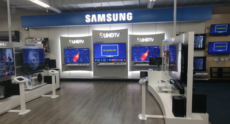
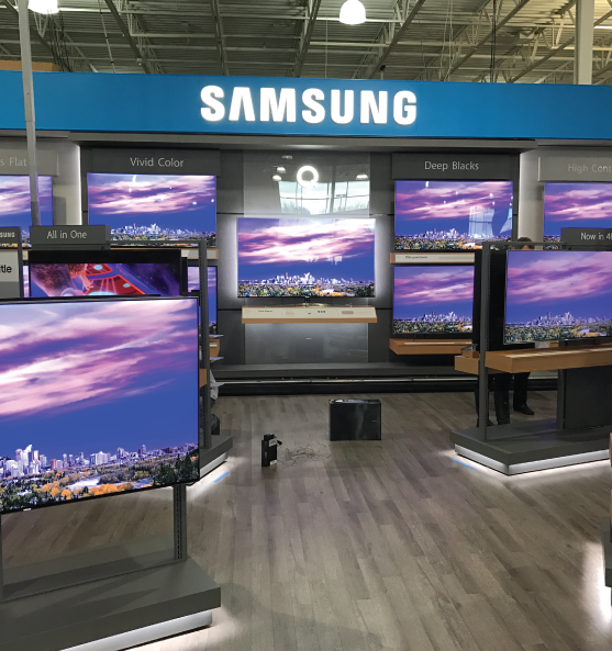
Ask: Improve the digital interface for Samsung TV retail environments
Previous system used tablet like screens for user interactions, but despite clear directions customers were still confused about how or when to interact with interface. It was a business decision to integrate physical buttons into each kiosk panel instead. Each kiosk had unique interactions and prompts that had to be designed for along with instructions, and product information.
The first step in our design process was to visit the current Store-In-Store experience for ourselves in a Best Buy store in New Jersey. As a team we interacted with the interfaces and recorded our experience through photos and video. We recorded not only our SIS but competitor’s layouts and button designs as well.
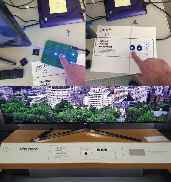
Since this was for a physical space, we tested our panel designs by placing them in a series of staging areas. The first of these were in our office, with a simulation of the retail space with actual TVs and print outs of the designs over circuit boards. Through continual testing we refined the design and placement of buttons and instructions.
The next step was to visit the production facility where the Store-In-Store would be built to test with a full size and functional prototype. Here our designs were tested within the real space. Refinements were made for the actual size of the panels after they were manufactured. This lead to a redesign of several multi-tiered audio panel interfaces whose intent was to test out several audio options at one time.
After this testing and some additional quality assurance, the Store-In-Store went into full production and our designs are now live in 660 Best Buy stores nationwide.
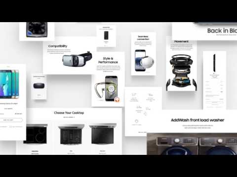
The ask: to update Samsung.com by redesign existing pages, while analyzing site architecture and user flows to include e-commerce.
With a large team that included UX and UI designers, strategists, copywriters, researchers and creative directors we set out to create a modular system that allowed pages to be easily edited instead of writing new code every time a new page was launched. This would ease the role of product owners as well as rectify the issue of inconsistency throughout the dotcom experience.
Through in person interviews we discovered that users had specific requests about what they wanted to see from Samsung.com and we created modules to meet those needs. Secondly we analyzed the overall strategy of what Samsung.com was and where it wanted to go. Stakeholders wanted a site that communicated clearly to consumers while promoting the brand and key product features.
As we designed the modules we worked directly with their development team to bring our vision to life. It was challenging at times, trying to convince the development team to change their mindset around structures and systems they had been using for a long time. As the deadline approached there was a lot of back and forth as well as plenty of quality assurance work to be done.
As a team we took into consideration and designed every last detail of the global navigation, the homepage, the category pages, gridwall (including filter and sort), the product detail pages, and the purchase configurators.
After our designs became a living site we were able to analyze strengths and weaknesses. The first role out was last year and initially was viewed as a success. It raised the bar for design on Samsugn.com as well as gave product owners the capability to upload and change their product pages on their own. But we saw that this was just the ground floor and wanted to build off of it. We soon realized there were several restrictions: for one thing, there was limitation in variety because there were only so many components that could be built. This led to Samsung.com having a very ‘boxy’ look. Also, The components were built with very strict rules and didn't allow modification. For example we couldn't change the background color, or add/remove CTAs. We didn’t want the site to feel like a bunch of blocks or utilitarian parts. Our desire was to reflect the messaging, content and contemporary tone of a leading edge technology company. The page flows & layouts should be dynamic, stylish, and informative and the user should not detect the components that are used to build it.
This led us to a second launch, which premiered this past spring. Components were built based off our learnings from the first launch and gave Samsung.com more of a dynamic feel. Now, besides new more elegantly designed components, the CMS has versatility in implementation of each component so we can move text, CTAs, images, etc. to suit our needs.