

The ask: to update Samsung.com by redesign existing pages, while analyzing site architecture and user flows to include e-commerce.
With a large team that included UX and UI designers, strategists, copywriters, researchers and creative directors we set out to create a modular system that allowed pages to be easily edited instead of writing new code every time a new page was launched. This would ease the role of product owners as well as rectify the issue of inconsistency throughout the dotcom experience.
Through in person interviews we discovered that users had specific requests about what they wanted to see from Samsung.com and we created modules to meet those needs. Secondly we analyzed the overall strategy of what Samsung.com was and where it wanted to go. Stakeholders wanted a site that communicated clearly to consumers while promoting the brand and key product features.
As we designed the modules we worked directly with their development team to bring our vision to life. It was challenging at times, trying to convince the development team to change their mindset around structures and systems they had been using for a long time. As the deadline approached there was a lot of back and forth as well as plenty of quality assurance work to be done.
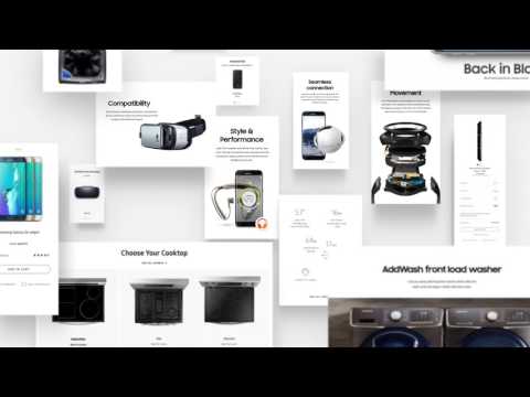
As a team we took into consideration and designed every last detail of the global navigation, the homepage, the category pages, gridwall (including filter and sort), the product detail pages, and the purchase configurators.
After our designs became a living site we were able to analyze strengths and weaknesses. The first role out was last year and initially was viewed as a success. It raised the bar for design on Samsugn.com as well as gave product owners the capability to upload and change their product pages on their own. But we saw that this was just the ground floor and wanted to build off of it. We soon realized there were several restrictions: for one thing, there was limitation in variety because there were only so many components that could be built. This led to Samsung.com having a very ‘boxy’ look. Also, The components were built with very strict rules and didn't allow modification. For example we couldn't change the background color, or add/remove CTAs. We didn’t want the site to feel like a bunch of blocks or utilitarian parts. Our desire was to reflect the messaging, content and contemporary tone of a leading edge technology company. The page flows & layouts should be dynamic, stylish, and informative and the user should not detect the components that are used to build it.
This led us to a second launch, which premiered this past spring. Components were built based off our learnings from the first launch and gave Samsung.com more of a dynamic feel. Now, besides new more elegantly designed components, the CMS has versatility in implementation of each component so we can move text, CTAs, images, etc. to suit our needs.