Fundera Internal Tools
AKA: Tree Trimming

Introduction
Like any start up, Fundera had started as several people in a room cranking away on a product. At that time there were no designers, just engineers. So when sales or sales ops would need a feature for our internal tool, called Treehouse, they would 'throw it over' to the engineering team who would then build it.
This process worked at first because they just needed to get something off the ground. But as you can imagine this built up layers and layers of actions and features that became complicated or redundant. Our goal with Tree Trimming was to take all those layers, analyze them, deem what was necessary and then rebuild an elegant, seamless process.
In more refined terms, we wanted to "systematize processes to ensure higher quality apps sent to lenders to enable company scalability". In plain speak this means that as Treehouse got built out the UX and UI became too complex and less intuitive.
“Before Tree Trimming, I would have to run 4 trainings to teach reps the basics. I now have to do only 1 training and can reallocate that time to practice and other skills.”
Objectives
User Experience
The user experience for the sales team was so complex that the ramp up time for new sales hires was 6 months. By providing a unified sales rep workflow with a built-in, guided experience, we aimed to increase the number of apps submitted by a reps who had been with us less than 6 months.
Process Standardization
Depending on who your sales manager was, a new sales hire would learn a different set of processes and work arounds leading to many people with the same job doing it in different ways. If we could improve the internal mechanisms we should be able to streamline the process and therefore speed up the entire application process. To track this we were looking at application completion rate (App Completion Rate).
Data Quality
Additionally, because there were a number of work arounds within the system and ways to force your way through to get the results you wanted, there was an issue with our data quality. Applications had incorrect or false information going to lender partners. We needed to solve for this as well. By incorporating data from verified sources and installing user guardrails we wanted to improve the number of applications that got back an offer (App to Offer Rate) while also increasing the number of borrowers who received an offer and funded with one of our partners (Offer to Fund Rate) .
Partnership Risk
With the inaccurate data overriding our matching criteria, we would be sending borderline unqualified leads to our lender partners. It costs time and money for them to process each application. If Fundera could not improve the quality of the leads being sent to a lender it would decrease the value of Fundera and our partners would be less inclined to work with us or develop new products. New guardrails would prevent duplicate and forced submissions, and send pre-qualified leads more effectively. With these improvements we were aiming to increase our the number of offers (Offer Rate) and the amount offered (Avg. Offer Amount) from various partners.
Approach
Listening session with users (sales reps)
Stakeholder meetings (Sales, BD, and Tech)
Understanding of core functionality needed to go from app to fund
Smaller rollouts, with iterations based on feedback
Discovery
For my initial investigations I scheduled time with 3 different groups of sales reps ranging in experience from junior level to seasoned veterans and reps with different managers. I wanted different perspectives from those that we were first learning the system and those that knew who to game it.
Each session of roughly 5-6 sales reps was set up as a guided tour of Treehouse. I would click through the interface asking along the way how they viewed the purpose, value, and roadblocks of each section. Essentially at the end of the session I wanted to know what does a rep need to do in Treehouse from A to Z in order to accomplish their job?

Session breakdown:
Walking through new application
Most common actions
What information are you looking for? Where is it?
Is there anything missing that you wish was readily available?
What are the scenarios where you need work arounds?
What tabs, buttons, links, etc are not used?
I was particularly interested in any work arounds that were not intuitive but were necessary for them to complete their jobs as well as any superfluous buttons or actions that no one ever used. If we could weave the actions they were trying to accomplish with the work arounds into the main UI and remove the unused clutter, that would already be a win for App Complete Rate.
Overall the answers were similar, but there was always a personal touch that each rep had that made their process unique. It was good to gather these insights to pull the 'best of' practices and incorporate them into the new work flow.
Simultaneously I would dive deeper with the stakeholders to better understand their vision for achieving our goals. We had the project kickoff and understood their high level intentions but I knew they had specific agendas in mind that needed to be 'unpacked'.
There were several of these conversational sessions where I would reframe what I was hearing into constructs or themes that we could all agree on. There were many features and actions that the stakeholders wanted to add into the current process, but I felt it was important to 1. hear out all their ideas, 2. bucket them together in commonality, 3. strategize with them to prioritize which features would be in a v1 and what could come later. (One thing that was always clear from the start was that this was meant to be a multi-phase project and we would not abandon it after one go).
It was also established that we'd have regular weekly check-ins with the stakeholders to update them on engineering and design progress.

Redesign
Taking the learnings from the research I set out to redesign the UX and UI. The easy part was removing the extraneous actions that were never used or outdated. The harder part was determining the ideal user flow and how that would relate to the new UI. Essentially what I wanted was a smaller footprint with clear guardrails and specific tasks.
Guardrails
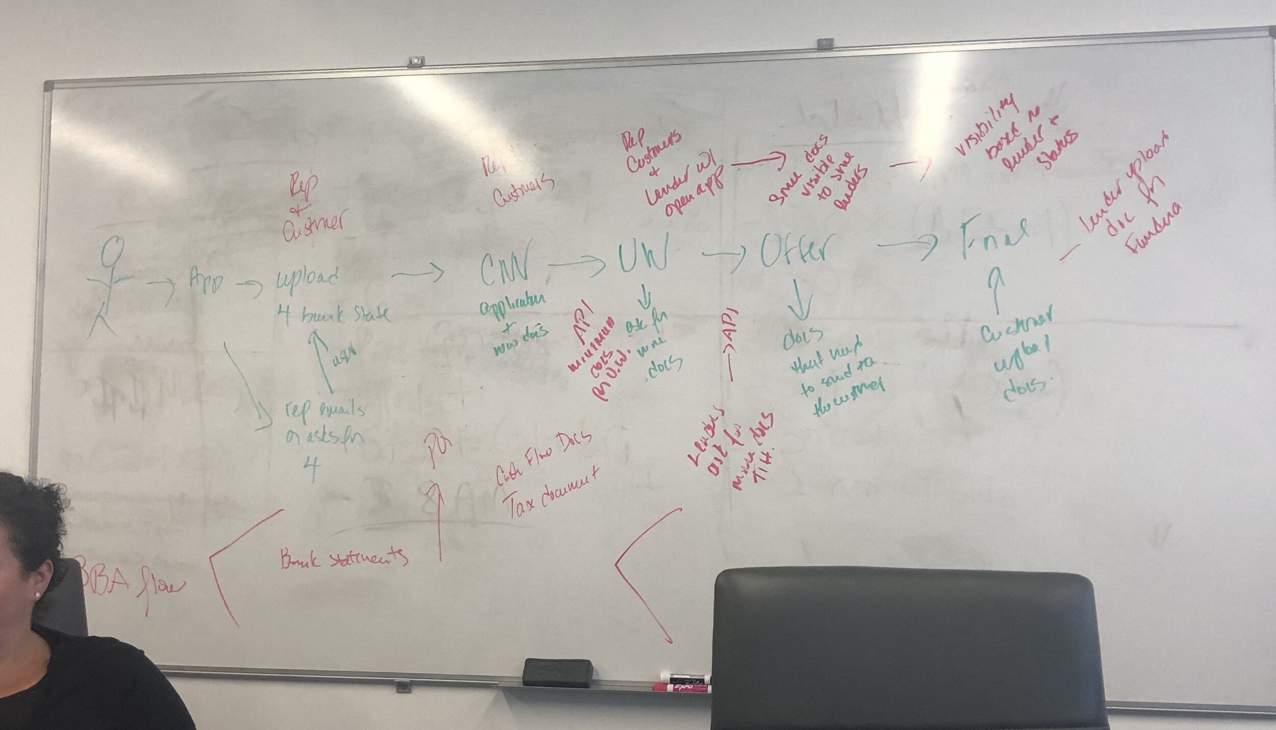
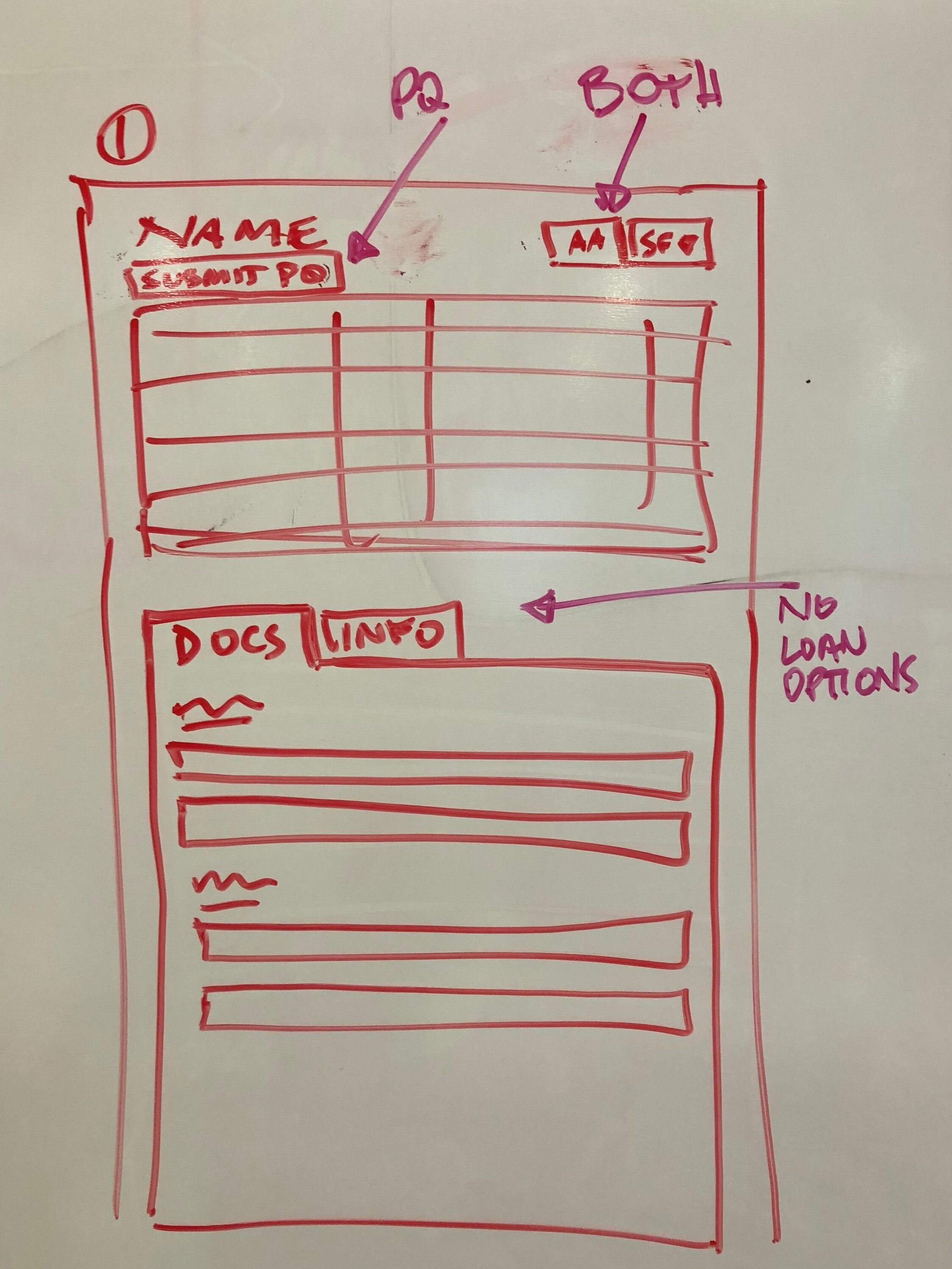
Previously a sales rep could submit to pre-qualification (PQ) to only certain lenders, then change the info in the application and send it to other lenders breaking down our original data about the borrower. Through a series of work sessions with our core team + stakeholders we created a solution that was a multi-step process for the sales rep to change the data with out altering the original application.
The previous system was also set up so that PQs would fire (via API) before the application was complete if enough info was there for a matched lender (this was a poor process because more info could come in later that would override the previous info). We wanted to create a flow where only when the application was complete and the documents had been gathered could a sales rep fire the PQ.
Old User Flow:

New User Flow:

UI Improvements
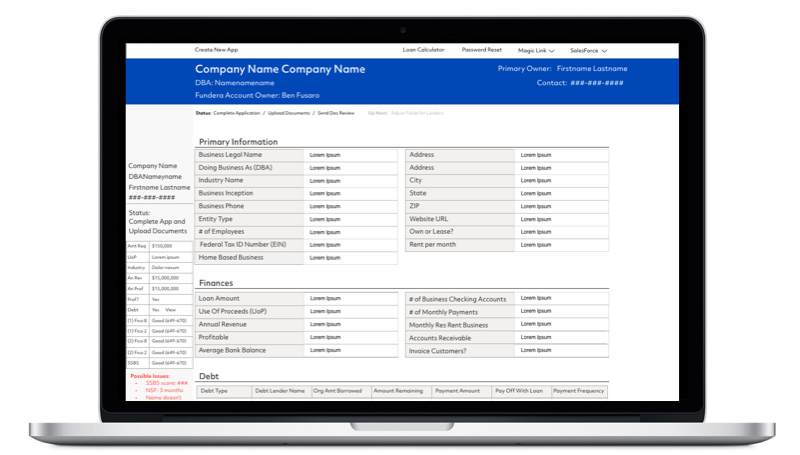
One important thing that would increase the intuitiveness of the layout was to reorder it to mimic the cadence that we receive the information. In the previous version the information was dispersed throughout the UI. This, plus adding new processes to insure the integrity of the application helped shaped the look and feel of the UI.
Another was to listen to the people actually using it. This may seem obvious but they specifically asked that the UI be one long scroll rather than placing different sections in tabs. It was much easier for them to have all the information in front of them at one time and not have to dig into tabs to look for data. This is also the reason for the lack of white space.
We planned on rolling out the product in stages. The first version would have the UX and UI improvements necessary for a sales rep to execute on funding a loan. Version two would be the addition of all the nice-to-have features that could be added on once core functionality was sorted out.

Features for v1:
Progress Bar to show current and next steps
Easily add additional borrowers
Sticky side bar for readily available info
Uniform buttons
Merging "Apply as Admin" into UI instead of separate page
Features for v2:
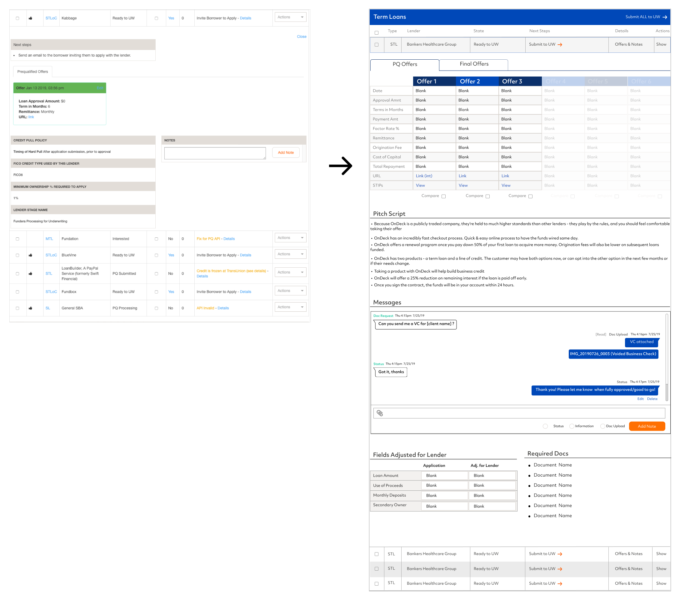
Comparison chart for offers
Loan Calculator
Show/Hide functionality for documents
Pitch script for each lender
Show Fundera rep which fields have been changed at the lender app level

Demo Video

Outcomes:
Initial pilot was rolled out to a subset of the sales org. that was a mix of new and veteran employees. We wanted to see where it would break and fix accordingly before a full launch. The team simultaneously built out new features and addressed bugs as they came in. We hit our goal and by the end of Q4 Treetrimming was rolled out to the entire sales org. with no hiccups.
End of Year Stats:
App Completion Rate: Up by 30%
Avg. Offer Amount: Up by 25% - 30%
Offer Rate (number of offers): Up from 18% to 25%
App to Offer Rate (number of applications that receive an offer): Up from less than 1 to 1.66
———————————————————————————————
Offers per app submitted Q2 Q3 Q4
Reps newer than 6 months .87 1.09 1.11
Previous ramp time for new hires was 5 months, with 1 month allotted for Treehouse. Design and UX improvements reduced Treehouse ramp time to new hires making deals within their 1st week.
“The stuff that a rep can do in their first or 2nd week at Fundera is drastically different than it used to be. Reps can now fill out the app, submit a borrower, pitch an offer and close a deal on their own. All of that was a month 2 activity before.”
“There are never problems with ‘Oh I wish I had applied to that lender.’ All options are very visible.”
“The single page UI is much easier than Classic and it’s easier to compare offers.”